
Welcome
To our valued Partners, Clients and Team members.
This guide is for anyone who wants to use Platinumlist's brand assets in their marketing or advertising materials.
The guidelines contained in this manual outline the general rules for proper and consistent application of Platinumlist's brand assets, and showcasing Platinumlist content.
Consistent use of these assets helps the general public to easily recognize references to Platinumlist and protect the brand's trademarks. It is important that your marketing materials use Platinumlist standards, and use the brand's approved assets correctly. This guide will help you meet those standards.
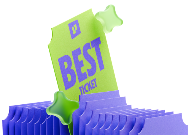
Assets
Download logotypesPlatinumlist Main Logo usage guide
The primary Platinumlist logo is the horizontal version, combining our portal icon with the typographic part.
Logo safezones
To maintain clarity and impact, always keep a clear space around the logo. No other elements should enter this safe zone, which is defined by the height and width of the icon.
Vertical logo
The vertical lockup is an alternate version for tighter layouts or centered compositions. It retains the same balance and expression as the horizontal logo. Just like the horizontal version, the vertical logo must have enough breathing room. Use the icon’s height and width to define the minimum clear space around the logo.
Icon
The portal icon can be used independently as a brand mark in digital spaces, social media, or when the full logotype is already present nearby. It symbolizes entry into experience — our core promise.
Logo placement rules
Generally, we avoid putting logo over the photo directly, with two exceptions:
- some cases of presentation covers, where the images are handpicked while not being a mandatory element
- short videos, where it’s inherently difficult to pick the right shade due to their nature
But when we do, we:
- use a monochrome logo
- use more or less uniform backgrounds and use black or white overlays to even them out
- avoid using high contrast images and logo in color
Colors
Our color palette is bold and expressive — but clarity always comes first. Avoid using background colors or gradients that reduce contrast or make the logo hard to read. The portal and wordmark must remain clearly visible across all applications.
Arabic version
The Arabic logo mirrors the structure and meaning of the original while respecting typographic and cultural integrity. Use it in Arabic-first contexts to ensure accessibility and brand consistency.
Co-branding
When Platinumlist appears alongside other brands, clarity and balance are key. Always maintain sufficient spacing between logos, and ensure Platinumlist’s logo is equal in visual weight and size. The portal icon and wordmark must remain fully legible, with safe zones respected. If co-branding with multiple partners, Platinumlist should always retain prominent, clear placement in the group.
For special cases or partnerships, please reach out to our design team for approval and support.


